The Single Feature that make the most User Experience with a music app
what every music app should have for better user experience
Many years ago when we had the introduction of various music players, there was a missing piece. Music apps were all about the music. Nobody really cared about the user experience of these music players.
We had a few apps that had some cool features. Some of the features were
Favourite Button
Repeat Button
Album category
And more.
But it was when my team and I were designing a music player app in the Side Hustle NG cohort 5, that we realized the transition and the innovation that comes with a proper music player.
This realization was all it took to know that it was a good move in UX designs of the app. I know you are keen on knowing what I’m talking about, just stay with me. I’ll show what I’m talking about shortly.
The project we worked on was not one of the familiar ones. Below its the exact music player project we worked on
**Product Design (UI/UX)
Design a music player. Consider the controls, placements, imagery such as the artist or album cover, etc. Also, consider the device type that's playing the music. A dashboard in a tour bus, a smartwatch, or via a web browser. Each device type will have different requirements, features, and restrictions to consider**
This project was given on the 26th June, 2022. And we had only 6 days to finish up. This happens to be the 4th design we are working on for consecutively, so we believe it will be an easy task.
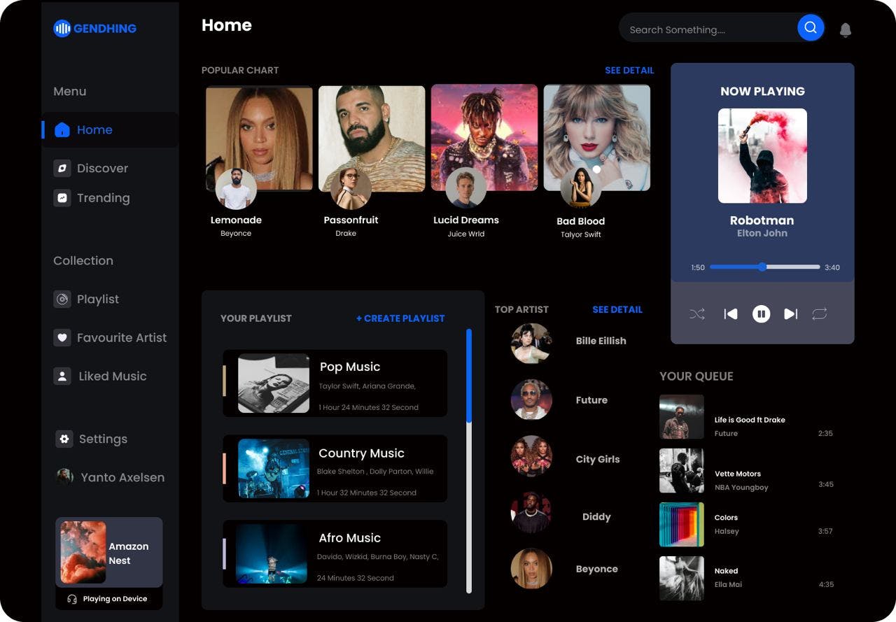
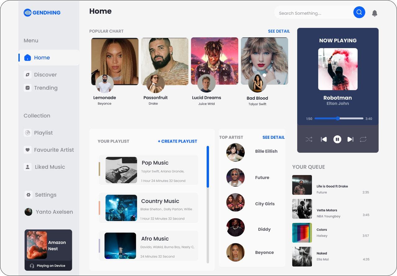
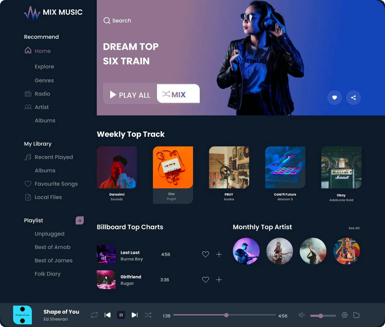
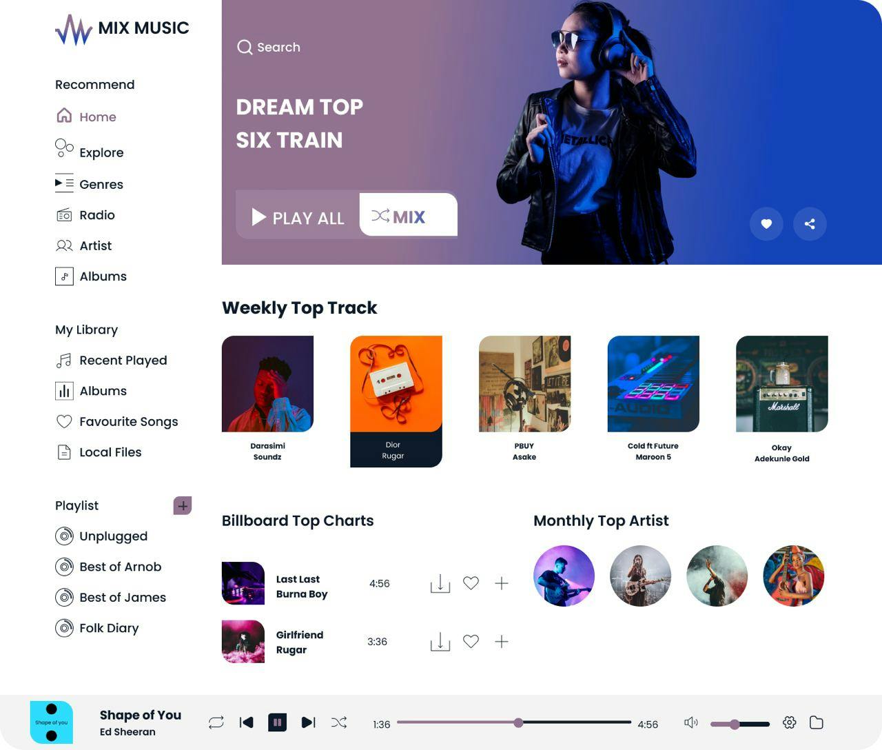
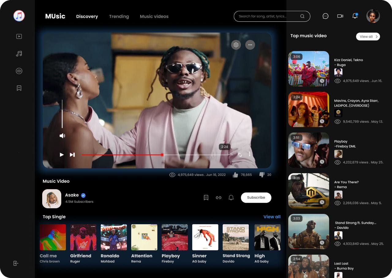
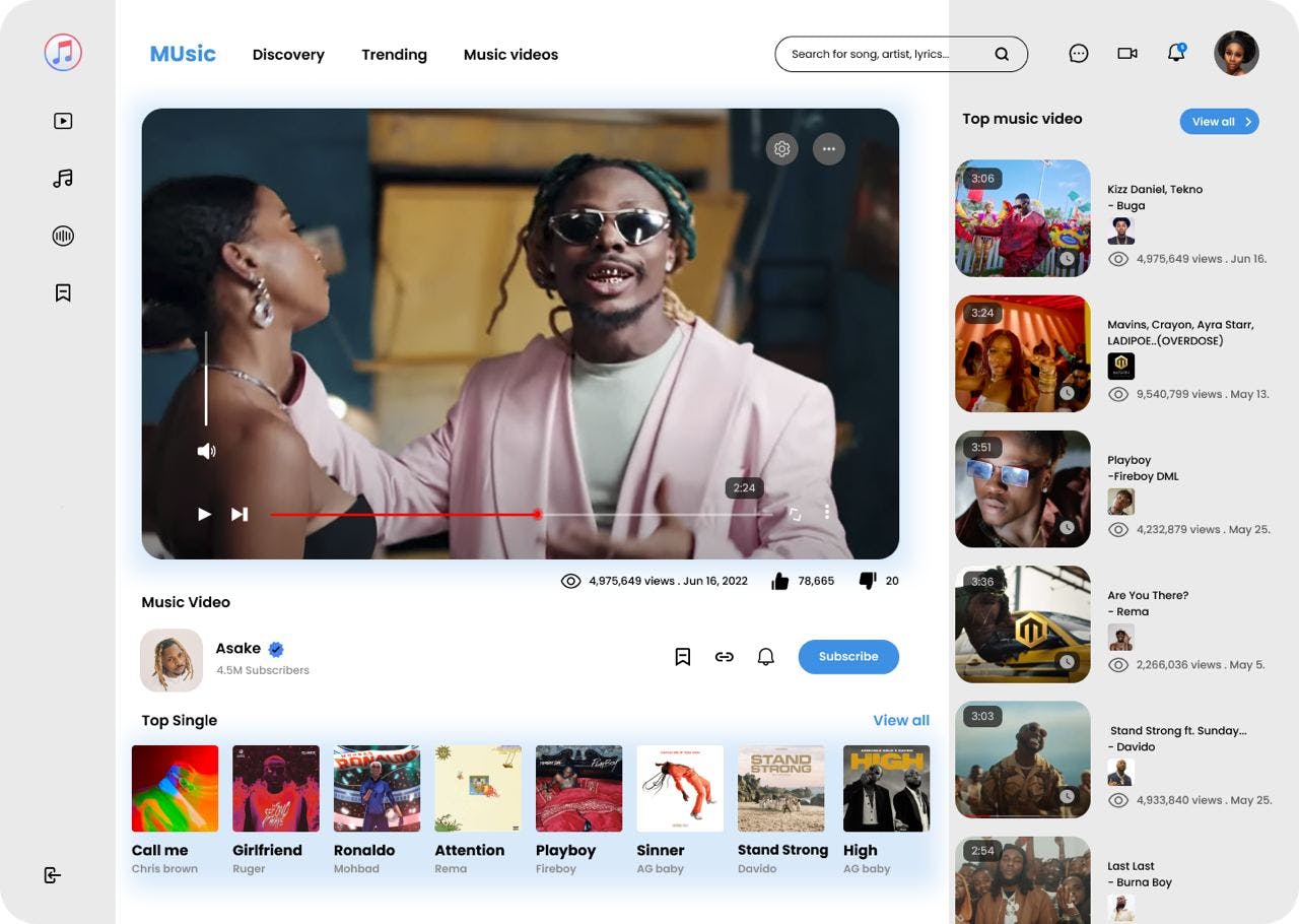
We designed up to 5 UI designs. But something made it awesome. This very feature has also made the UX of every music app amazing and worth the experience. It is the DARK MODE FEATURE.
If you can recall, from the inception of the music player app, we had no dark mode. Even till this point, some music apps still don’t have it. But I can tell you categorically that the dark mode of a music player is one the most important features of the music player.
Stefan Tweraser, Chief Product and Growth Officer at Deezer commented:
“Dark mode is not only one of the most requested features from our users, but it’s also one that we are personally excited about. While we love our new rebranded app, we also understand that in some situations, it would benefit users to switch between light and dark. So, whether you want to prevent eye strain or it’s just your preferred style, Deezer’s dark mode is for those who dare to venture to the dark side.
This mode is great when you’re using the app at night or your eyes need a break. The feature saves battery and offers a better user experience, allowing you to select the theme that suits your mood or occasion.
As part of our project, we made some UI designs, but it wouldn't complete if we do not add the much preferred dark mode.
